FitBuddies
Fostering Fitness & Friendship
UX/UI Research and Design Case Study


Many people want to exercise and improve their fitness but struggle to start. My aim was to investigate ways to encourage people to exercise more regularly.
The Problem
The Solution
Encourage exercise by promoting social interaction and offering rewards for staying consistent.
FitBuddies is a mobile app enabling users to find workout partners and coordinate exercise sessions for a social and enjoyable fitness experience.
The Product


In January 2023, as I started my very first UX design project, I noticed how many people were making the New Year's resolution to "getting in shape”. I got curious about the struggles people had with keeping this resolution and wanted to find out what was stopping them. My goal for this project was to figure out what was keeping people from exercising and then to design a digital platform to help them overcome those hurdles.
Project Overview
I had the roles of a UX researcher, UX designer, and UI designer. My job was to research and understand the users, figure out the problem, come up with ideas for a solution, create a prototype of the product, and test it with the intended users (doing the last two steps multiple times to make improvements).
My Role
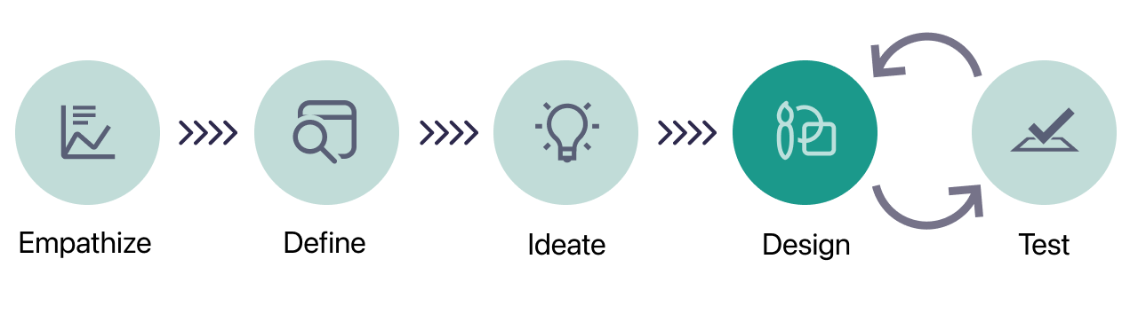
Design Process


Instead of immediately diving into designing wireframes, I used several types of quantitative and qualitative research methods to gain a better understanding of my target users: individuals who want to start or do more exercise but encounter obstacles when doing so.
Desk Research
I started the discovery process by completing desk (secondary) research. I decided to review relevant literature because it gave me a better understanding of the context of the issue, helped inform further research, and guided early design decisions.
In my research I reviewed ten academic studies on barriers to physical activity. One of the most commonly cited behavioral barriers was lack of social support. A 2011 study (Withall et al.) explained:
“The need for support, confidence, and competence in order to take up activity was widely expressed, particularly among women.”
Withall, J., Jago, R. & Fox, K.R. Why some do but most don't. Barriers and enablers to engaging low-income groups in physical activity programmes: a mixed methods study. BMC Public Health 11, 507 (2011). https://doi.org/10.1186/1471-2458-11-507
User Surveys
In the next phase of my research, I created and shared a user survey on social media* (Instagram, LinkedIn, multiple subreddits, etc.). I decided to do so because a user survey would provide me with a direct line of communication with potential users. Gathering both quantitative and qualitative data on users’ exercise habits, motivations, and preferences ensures that the resulting product truly aligns with their needs.
*I realize that using these recruitment methods may have attracted a specific, possibly homogenous group. However, these channels were the most effective way to recruit participants given time constraints. If I could re-run the survey and had more time, I would have gathered more in-person data in public locations (e.g, library, post office, grocery store).
While I ultimately obtained 78 survey responses, only 20 participants fell into the target user group (the “resolutioners”): people who exercised one time a week or fewer but wanted to exercise more. Analyzing data from the target group, I gained the following insights:

Barriers included lack of time, lack of motivation, lack of exercise knowledge, lack of an exercise partner, and high cost.
Possible motivators included, flexible timing, low cost options, a personalized exercise plan, activity tutorials, and working out with an exercise partner.

User Interviews
I chose to complete user interviews as my final research method because, unlike surveys or analytics, interviews allow designers to ask open-ended questions, uncovering not only what users do but why they do it. Interviews also foster empathy, enabling designers to put themselves in users' shoes and design solutions that cater to real-world needs and challenges.
I reached out to all eight of the survey participants that both fell into the target group (the “resolutioners”) and had opted in to talking with me further. Ultimately, I interviewed five individuals: three men and two women (age 28-35). All interviews were completed remotely via Zoom and transcribed using Otter. ai. The interviews covered participants’ current and past exercise habits, frustrations and barriers when trying to exercise consistently, and aspects of exercise that they enjoyed and found motivating.
Interview Insights
I synthesized the qualitative data I gained from my interviews using affinity diagraming. It provided me a visual way to gather the noteworthy observations and quotes from my interviews, group them into themes, and extract actionable insights to help guide my future designs.
I gained five particularly valuable insights from my data synthesis:
Users felt working out with friends made exercise more fun, improved accountability, increased perceived effort during the workout, and increased willingness to try new things.
Users tended not to stay consistent with an exercise when they just did it because they were told it was a good workout; true enjoyment led to increased consistency.
For some users, group fitness classes or working out in groups of people was often intimidating and led users to avoid workouts, while other users found working out with others motivating.
For some users, gamification was intimidating (introducing the possibility of failure), while other users found gamification to be highly motivating.
Users generally felt uncomfortable when a workout was perceived to be above their skill level and felt more comfortable when they were provided with individualized instruction.


Aided with the insights from my research, I needed to build a complete picture of the users I was designing for. This holistic view would strengthen my grasp of the challenges and requirements they faced and help me accurately define the problem(s) I aimed to solve.
User Personas & Empathy Maps
I decided to use personas to distill the insights I gained from my research into two representative user archetypes. I chose personas because they would provide a simple reference point for decision making through the design process.
However, after completing my user personas, I realized that empathy mapping was likely the more informative method to use to construct an understanding of the target users. I wanted to design a product that modified user behavior and empathy maps spotlight the emotional and behavioral aspects of user interactions.
As I created these empathy maps, it became apparent that there were really two kinds of target user: the “tentative user” and the “inconsistent user”. The tentative user was anxious about trying new types of exercise, while the inconsistent user struggled to stick with an exercise routine.


These two types of users had a lot of the same problems and could benefit from similar solutions. But there were also some problems unique to each archetype. The minimum viable product (MVP) I was designing wouldn't be able to address all unique needs of each user archetype. However, I needed to thoroughly define these needs before I decided on the scope of my design.
How Might We (HMW) Questions
Before I could brainstorm solutions, I had to clarify exactly what needs/problems/pain points my design was trying to address. I formulated five HMW questions to help guide my ideation exercise:
How might we increase social connections when working out?
How might we provide a way to track progress while working out without creating the opportunity for failure?
How might we increase confidence during workouts?
How might we promote trust that workouts are consistent with individual goals?
How might we personalize the experience among different user groups?

Brainstorming Session
I used the HMW questions I formulated in a solution ideation session. I set a one-minute timer to brainstorm as many solutions as I could for each question. Then, I organized these solutions into groups based on common themes for each question. In the end, I brought together solution groups (below) from all the questions. While I knew I wasn’t going to be able to address all needs, this process helped me group solutions together that could realistically be included in a MVP.
After identifying the problems to address, I brainstormed specific solutions and features, considering how to organize them effectively within the product.

User Stories
At this juncture, I needed to make a decision about the scope of my MVP. Was it going to be an app that focused on creating relationships? Was it going to be an app that focused on educating people about exercise? Starting the process of narrowing the product scope, I used the solutions I came up with in my brainstorming session to formulate user stories:
As a novice gym-goer, I want to connect with other people in-person so that I am motivated to go to the gym.
As a novice gym-goer, I want to try different activities so I learn what I like.
As a novice gym-goer, I want to connect with people online so that I can talk about my experiences and ask questions.
As a novice gym goer, I want to receive rewards for my workouts so I stay motivated.
I completed a second brainstorming session, giving myself two minutes to come up with as many features as possible for each user story. I grouped those features by theme and used the MoSCoW (Must Have, Should Have, Could Have, Won’t Have) sorting method to select which features I would include in my MVP.

User Journey Maps
Ultimately, I determined that the most important features to include in the MVP would be the following:
Find different workout buddies in order to make working out more social and fun, to create a social contract to actually meet up and complete the workout, and to provide variety by completing different types of workouts with different buddies.
Earn rewards once users have completed a certain number of workouts in order to incentivize and gamify completing workouts.
I created two user journey maps served as rough outlines of how users would interact with the product:

App Mapping + Card Sorting
With a basic grasp of the MVP features, I crafted the initial visualization of the product's structure. Subsequently, I conducted an eight-person* open card sorting exercise** to evaluate the logical arrangement of information. Based on the insights from this exercise, I refined the app map, incorporating changes that emerged from the card sorting task (focusing primarily on data gathered from the similarity matrix).
* My initial goal was to complete a 15-person card sort but I was only able to obtain eight completed exercises due to participant attrition and time constraints.
** In hindsight, I would have made this a closed card sort so as to result in more controlled and robust grouping of categories.
App Map Iteration 1
App Map Iteration 2


User Flows

Heuristic Analysis of Competitors
After outlining user flows, I conducted a thorough analysis of competitors' designs. This involved evaluating their interfaces against established usability heuristics to identify strengths, weaknesses, and potential areas for improvement. By understanding how competitors approached user experience, I gained valuable insights to refine and enhance the design of the product, ensuring it meets or exceeds user expectations in a competitive landscape.

Sketching Red Routes
I was excited to begin designing the first iterations of my screens: sketches of the critical design paths in my MVP. The red routes included the onboarding flow, finding a buddy and requesting a workout, accepting/declining workout requests, redeeming rewards, and general browsing through the home screen and tabs. Below are a few examples:

Find a Buddy + Request Workout Flow

Accept a Workout Request Flow

Redeem Rewards Flow

Guerrilla Usability Testing
Prior to my first round of testing, I hypothesized that there could still be significant improvement made to the architecture of the app (especially as features were added and subtracted) and that the filter/search process may have been overly complex.
I created a clickable prototype using Marvel for my guerilla usability testing. My participants were five friends that were unfamiliar with my project. Testing was completed both remotely and in-person.
After the first round of user testing, I received a significant amount of helpful feedback. I chose to implement the changes that were the most impactful to the design of the app, including:
Clarifying the purpose of features by changing ambiguous language (call to action copy, button copy, card labels, etc.)
Adding flexibility that afford users multiple paths to accomplish a task.
Low Fidelity Wireflows
With the insights I gained from my first round of usability testing, I began working on low fidelity wireflows of the MVP’s critical paths. I chose to do wireflows before designing high-fidelity mockups because I wanted to ensure my focus was on functionality and structure, instead of spending too much time trying to perfect every visual design detail.
Below are wireflows for all MVP red routes:

New Buddy Search and Workout Scheduling Wireflow

Onboarding Wireflow

Accept Workout Request Wireflow

Redeem Rewards Wireflow

Homepage and Tab Menu Screens

Workouts Tab and Sub-screens
Design System
Once I had a strong grasp of what the content and structure of my product would be, it was time to focus on visual design. I created a mood board for initial inspiration, a fist draft style guide, and final design system to standardize the UI elements included in my high fidelity mockups. Below are several pieces of the design system. The full design system can be found here.
Accessibility
Prior to actually designing my high fidelity mockups, I ensured that the app met iOS accessibility specifications.
All color contrast ratios met WCAG AA guidelines (at minimum) and WCAG AAA guidelines when possible.
Button copy was written to indicate the button action without relying on color.
All icons (or padding around icons) were 44px x 44px at minimum.
High Fidelity Mockups and Animated Prototypes
Next, I used Figma to design high fidelity mockups of all my red routes and clickable, animated prototype:

Usability Testing (Rounds 1 + 2)
Understanding that the success of any product hinges on its usability, I conducted two rounds of testing* to identify user pain points, improve task efficiency, and gather insights. I then used those insights to facilitate Informed Iterative design that ultimately improved task efficiency and enhanced user satisfaction.
*The first round of testing consisted of five moderated testing sessions (three in-person and two remote). The second round of testing consistent of another five moderated sessions (all remote). All remote sessions were completed over Zoom.
Due to both resource limitations and time constraints, I was forced to strategically leveraged my personal network by recruiting friends as participants. This pragmatic approach allowed me to efficiently gather valuable insights from diverse perspectives within a limited timeframe. While this solution may not be ideal for all projects, it served as a practical and accessible method to meet testing objectives under the given constraints.
After each round of testing, I identified user paint points, prioritized issues by level of severity, and ideated on possible solutions to the “critical” and “major” paint points. Through several design iterations, there were three aspects of the app that went through significant changes: the filter button, buddy profile pages, and the date and time pickers.
Below is a description of the evolution of each feature:
The Filter Button
When a user goes to find a workout buddy and schedule a workout, they are given the option of filtering results by different criteria. In the first round of testing, users were unaware that there was a filter function and tended to just scroll through the results. To address this, I replaced the filter icon with a large “Filter Options” button at the top of the page.
During the second round of testing, the filter button continued to go unnoticed. When the button was pointed out, users reported that the color did not contrast highly enough with the background. To address this, I increased the contrast of the filter button and added a search field in a spot consistent with industry norms.


Version 3


Version 2
Version 1
Buddy Profiles
Users mentioned that they wished they could see more information about a potential buddy without actually going to their profile page. They wanted to know at-a-glance if someone was going to be a good fit for them. In order to give users access to more information with less effort, I switched from a map-view interface to a swipeable interface (much like those used in common dating apps) to quickly glance over different users.
This paint point was brought up in both the first and second rounds of testing. However, it only became a high enough priority to address by the third iteration of the prototype.


Version 2 - Swipeable profile
Version 1 - Profile page
Version 1 - At a glance
Date and Time Pickers
In the first design iteration, date and time selection were in a calendar view and only got as specific as “morning”, “afternoon”, or “evening”. In the first round of testing, users expressed a strong preference for the ability to select specific times, but not have to provide their availability for an entire month at once. To address this, I switched the date picker to a weekly view and the time picker allowed for in hour-long increment selections.
In the second round of testing, users expression confusion over the date picker format: it wasn’t clear that the user had to scroll horizontally to see the rest of the date options. Users also indicated that having to scroll through and select all desired time options was tedious (ex: indicating availability from 12pm-6pm meant selecting 6 different buttons). Some users verbalized that they would have wanted to select times by the half hour. To address these issues, I changed the date picker from a horizontal to a more intuitive vertical scroll. I changed the time picker to a traditional iOS bottom sheet time picker, which gave the user the ability to indicate multiple time ranges in a day, with no set time increments. Users were also able to set their selected availability as recurring so as not to have to fill out the same information several times in a row.
Version 1
Version 2
Version 3


A digital product is never done. Even after completing my case study, I’m already aware of what some of the next user-informed improvements should be:
Reflections and Continuous Improvement
Relocate User Profile
Users expressed that they perceived their own profile information as less critical on the home screen. Instead, they desired the home screen to prominently feature recommended buddies or highlight received workout requests.
I propose relocating the user profile information to a more discreet yet accessible location, represented by a profile picture icon situated in the top left corner of the screen.
Add "Favorites" Feature
While there is a "favorite buddies" section within the Workouts tab, there is no direct way to indicate "favorite" status on a buddy's profile. To address this, I suggest adding a star or heart button to each buddy's profile.
This button would default as unselected, but users can tap the button to mark a buddy as a favorite, causing the button to fill, and the buddy's profile to be seamlessly added to the "Favorites" section.
From a methodological perspective, there are also several decisions I made in this project to learn from and improve on in the future:
Emphasize the “Minimum” in MVP
In future studies, my focus would be recognizing the tendency to be enthusiastic about ideas, especially as a solo contributor.
I will aim to prioritize only essential features for the initial product release rather than incorporating non-essential elements.
Enhanced Participant Recruitment
Moving forward, I would likely use a participants recruitment service to increase the participant pool for quantitative and qualitative measures to ensure more robust and representative results.
Moving forward, I would prioritize recruiting a larger and more diverse range of participants (outside of my own social network) to mitigate the potential for homogeneity in the findings.